Subscribe

Enter your email address:

Designer Monthly Preview

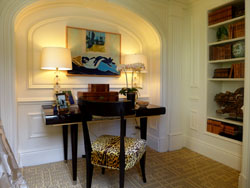
The woman who helped usher the interior design industry into full flower in the United States was prolific in putting out ideas that will help freshen up today's interior design business. Look at our latest Designer Monthly, Interior Design: Look Forward by Looking Back to Dorothy Draper.

Did you ever have a problem designing small spaces?  Take a look at how top interior designers solved this common problem in our latest Designer Monthly, How to Design Small Spaces at the Kips Bay Decorator Show House.


Wednesday
Feb272013

How to Dress Up Your Walls - Part I

One of the first things I notice in homes when working on an interior design job is the artwork or lack of artwork on the walls. Usually there’s very little on the walls – just a lonely print or photograph and that’s it. I don’t know if it’s a tight budget, fear of making a mistake or just sheer laziness, but dressing up your wall can really be the easiest and most enjoyable way to establish a style in your home.  It could even be the least expensive way to liven up your interiors.

(photographs, courtesy of Sonic Editions & from left to right: Michael Ochs Archives, Peter Ruck, Michael Ochs Archives-next two, and McKeown) The first question I get usually asked is where does one start? That’s easy - usually I begin with what the client has.  This can also be the cheapest method.  I ask what kind of collections, hobbies, artwork, and photographs do they already have. Then I start nosing around in their photo albums, their closets, and their attics (with their permission, of course!)  to see what I can work with.  Sometimes a client can overlook what’s right under their nose. 

After I’ve evaluated the available art work and accessories, then I turn to creating possible themes.  Sometimes, by just looking at what the client has, I can figure out their interests.  It could be travel, which can be narrowed down to specific countries of the world; it could be animals, nature, sports, and so forth.  The third step is determining the mood they prefer – do they want formal, casual, rustic or sophisticated? After those three steps, then I really get down to work and plan out the walls. 

If a client has portrait photographs of friends and family, I start with those and create a story around them.  Above is a version of a photo wall in a formal and elegant mood.  To invoke an elegant style, I kept the photographs to black and white mode with simple frames and interspersed it with the sparkle of distressed mirrors to add dimensionality (Dubois mirrors from Crate and Barrel). The strong photos (limiting it to close-up portraits) and the beautiful mirrors create a strong statement to any room.

A more casual and relaxed approach is to create an asymmetrical wall with different shapes and sizes that are hung in a non-linear way. This technique is great for those odd shaped art work or accessories. Since many people usually have souvenirs lying around their homes from their vacations, travel can be a starting point for dressing up a wall. Above is an example of a travel theme – that of Spain. I started with a travel poster of Madrid and expanded from there. Spain is known for their beautiful tiles, a result of their Moorish history, and these tiles have such intricate designs that they can be hung like artwork instead of just using them for flooring. The final touch is the Marietta mirrors from Joss & Main with a shape reminiscent of Moorish tile work. The muted earth tone colors ties all the art and accessories together.

Stay tuned next time for further examples on how to dress up your walls!


Interested in learning more about accessorizing? Take a look at Sheffield School's Complete Course in Interior Design. At Sheffield, you'll learn how to transform a space, create color schemes, and select furniture, lighting, and accessories.

 

Reader Comments (15)

I like the first set of wall dress up. Linear design for me is more elegant to look and neat.
March 1, 2013 | Unregistered CommenterCU Web Design
I find placing a mural in the living room more pleasing than putting up a wallpaper. This is my way of dressing up walls. For sure, when you will have a dinner party, the mural will be a great talking point.
March 1, 2013 | Unregistered CommenterCarlos
Hi there, I think both examples are very nice but it al depends on the rest of the interior. It has to fit with the rest of the furniture. If you have a very classic house and furniture then I think it is nicer to keep it with just a single painting or picture and not a hole wall. So there are a little more faccotrs to concidere. How is the house, what kind of furniture, what kind of people etc. Looking forward to your next blog.
March 3, 2013 | Unregistered CommenterRonald
Hello, The first thing i would look at before even looking at the walls is the room itself, what size and what type of furniture is in the room. If the room is small putting loads of pictures on the wall will only make it look smaller. I would always put a mirror on the wall this would then give the impression of more space. You can then add a few pictures in places, there is an old saying "Less is more"

Look forward to your next blog..
April 14, 2013 | Unregistered CommenterJames
A secret to well-designed rooms are often in the wall detailing. Wallpaper, wood paneling, and even tile can add a layer of interest and finish the room's polished look.
People don't realize that a lot goes into good design - it's not just an accident that your home looks really nice. Getting that look to gel and express your tastes and personality is even tougher! Some good tips here! I think my OCD would keep me from going with the asymmetrical look, but I can see it's appeal!

Going to hop on over to Facebook and connect with you guys there now as wel! :)
April 16, 2013 | Unregistered CommenterChuck Lichtenhan
Hello! Great article, I really need it! Today I found a very interesting site that describes the game "Panzar: Forged by Chaos". It's a great game. Something about the game: In Panzar, players command Their character, chosen from eight different classes, in fierce and ruthless combat. Each battle pits two teams of players against each other, fighting for victory in a variety of game modes, dry as Siege, Domination or King of the Hill. In a stunningly beautiful combat, powered by CryEngine 3, Orcs, Elves, Dwarves and Humans all gather up to fight it out to see Which team is left victorious. After every battle, players spend Their hard-earned gold and experience to develop and improve Their characters, making them all the more deadly for the next encounter. The time for talk is over! Choose your destiny and let bloodlust take over! I also found: Panzar Hack v4.1 is very good. It works instantly. Panzar Hack download is only for gamehack.eu.
May 11, 2013 | Unregistered CommenterEverett
These are some great tips. Do you have any suggestions for outdoor walls?
June 13, 2013 | Unregistered CommenterBrett
What to do if its a cottage like atmosphere? Walls are wooden and floors are wooden. Also, they already have some artifacts displayed on the wall.
June 17, 2013 | Unregistered CommenterJames
The most important thing is, most people don't have a artful mind. You also can't expect it on every house.
June 30, 2013 | Unregistered CommenterDress up games
Thx for sharing this blog..
July 12, 2013 | Unregistered CommenterMisha Yazdi
These are some great tips
July 16, 2013 | Unregistered CommenterGeorge M
Your approach is dead-on! Wall art should incorporate a person's interests and personality. The artwork showcased in a person's home is an extension of themselves and brings excitement to their walls. Everyone has different tastes in art, and even different product types--some prefer art prints, canvas prints, framed art (from basic to wild frame borders), wall decals, or wall stickers. The elements of the room could be secondly considered, but art doesn't have to always match the furniture (funny art print link: http://www.allposters.com/-sp/Couch-Posters_i8684283_.htm).
August 21, 2013 | Unregistered CommenterJermaine
Great. It is important is usually, the majority of people don't have some sort of artful mind. You additionally can not count on this upon every property.
August 22, 2013 | Unregistered CommenterReal estate for sale
pictures of different
September 3, 2013 | Unregistered Commenterzatenben

PostPost a New Comment

Enter your information below to add a new comment.
Author Email (optional):
Author URL (optional):
Post:
 
All HTML will be escaped. Hyperlinks will be created for URLs automatically.